
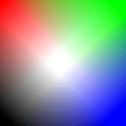
- To the left is the original image.
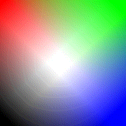
- to the lower left is the same image, displayed on an 8-bit display with the Browser-builtin dithering.
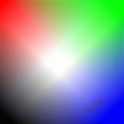
- to the lower right is the image, dithered to the Web-Palette with Gimp.
This page claims something contrary to lots of books about webdesign: Please dont dither your images to the web-palette in your Pages.
 |
The first image are some randomly blended colors.
|
 |  |
|
If you dither this image to the optimal palette (left) you can see, that
there are flaws in Gimps built-in dithering. To the right is the same image shown on an 8-bit display. Here the two ditherings interfere and the result is worse. | |
 | 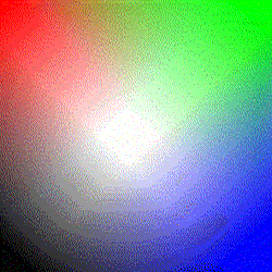 |
So what did we learn? The best thing is to use the Original. On 8 bit Displays there is no visible difference between the Web216-palette and the original. On true-color displays the Web216-Version would annoy the visitor, because there is an unneeded dithering across the image.
By the way: The original has 1/5 th of the size of the web216-Version
From left to right:
 |
 |
 |
 |
 |
Again we can see, that using the Web216-Palette has no advantage over using the original. The 8 bit user won't notice if you use the original, the true-color user will notice, if you use the Web216-Version.
Here the Jpg-version is still the smallest version
 Original Gif with 19 Colors, good antialiasing. |
 Optimal Palette with 16 colors |
 The original, showed on an 8-bit Display |
 The Web216 Version |
 Optimal 16-color palette on a 8 bit display. |
As we already know: The original version on an 8-bit Display looks exactly the same, as the Web216 Version.
I admit, it is hard to spot, but you can see, that the antialiasing is better in the original/16 color version. So here we have an advantage over using the web-palette too. And we do not have to hazzle with converting too much...
Here the original image is 600 bytes bigger than the web216-version.
But there is a use for the web-palette. If you search a base-color for a title or a big unicolor area select a color from the 216-color cube. Then an 8-bit browser can show this mostly "as is" and does not have to dither the plain area. But dont care for the web-palette when antialiasing an image.
In the last example you can see a Logo with two base-colors: one from the Web216 palette and one slightly different. In the second image you can see how Netscape shows this on an 8 bit display. Guess, which is the color from the color-cube!
 |
 |